01 | Ecosystem Audit: Understanding the Landscape Before Solving It
To bring consistency and integration to Hill’s digital ecosystem, the first step was developing a clear understanding of what existed today. Rather than jumping into design solutions, I conducted a comprehensive audit of all major platforms—evaluating each in terms of information architecture, functionality, and role within the broader veterinary workflow.
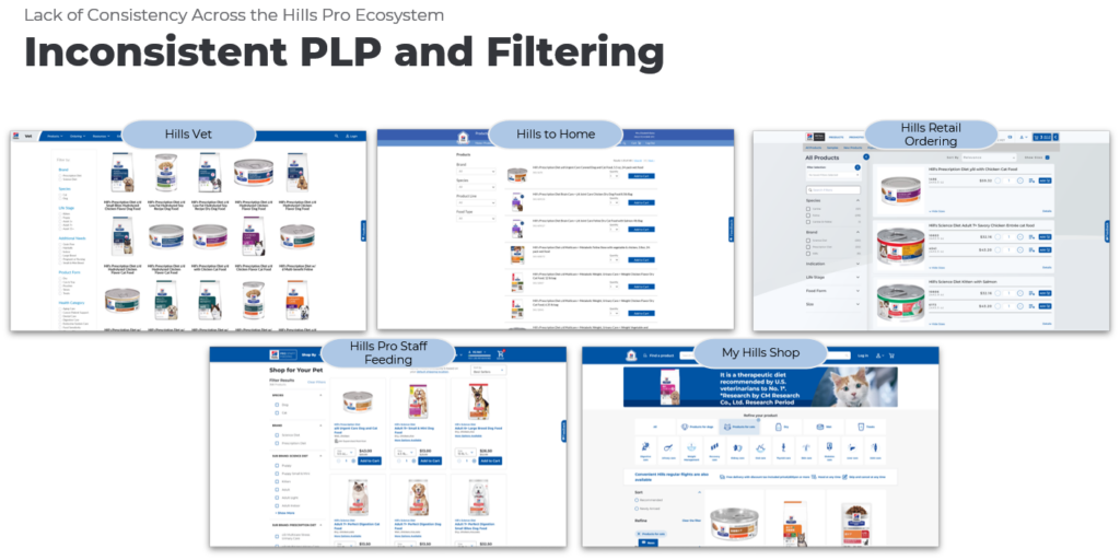
This included platforms such as Hill’s Vet, Retail Order (HRO), Hills to Home, Pro Staff Feeding (HPSF), and Veterinary Academy—each built at different times, on different systems, and often serving overlapping needs.
What Was Evaluated in Audit
1. Purpose & Role Clarity
Each platform was assessed to determine its intended role vs. how it was actually being used. However, these roles were often unclear to users, resulting in fragmented journeys and duplicated effort.
For example, traffic declines on Hill’s Vet were initially perceived as a performance issue—but analysis revealed that traffic had simply shifted to other platforms like HPSF, highlighting how disconnected measurement was across the ecosystem.
2. Information Architecture & Navigation
I mapped how information was structured across platforms and how easily users could find what they needed.
- Navigation patterns varied significantly across sites
- Similar content (products, education, tools) appeared in different formats and locations
- No shared taxonomy or consistent labeling system
This created a cognitive burden for users—especially in fast-paced clinical environments where time is limited.
3. Functional Capabilities & Overlap
Each platform was evaluated for its core capabilities and where duplication or gaps existed.
This led to a “Frankenstein” ecosystem—where users had to navigate across multiple tools to complete a single task.
4. User Workflows & Role Alignment
A critical part of the audit was understanding how well each platform aligned with real veterinary workflows.
From research, it was clear that:
- Veterinarians, vet techs, and office staff all play distinct roles in the same journey
- Nutrition discussions happen in ~63% of appointments, with recommendations in nearly half
- Users often rely on memory or quick tools due to time constraints (e.g., 10–15 minute consults)
Yet the ecosystem was not designed around these workflows—it was designed around products and internal systems.
5. Cross-Platform Experience (or Lack Thereof)
I evaluated how users moved between platforms.
Key issues included:
- Multiple logins with no unified identity
- No continuity between actions (e.g., recommendation → purchase)
- Inconsistent UI patterns (PLPs, PDPs, filters, search)
- Frequent “dead ends” where users had to restart tasks
This fragmentation was consistently reinforced in stakeholder interviews and global audits, where teams described the ecosystem as siloed and difficult to navigate.
Bottom Line
Before designing anything new, we uncovered the real problem:
The challenge wasn’t usability within a single tool—it was the lack of a cohesive, connected experience across all tools.
02 |Stakeholder Interviews & Data Synthesis
To complement the audit, I conducted interviews with product and platform leads across the ecosystem to understand each application’s goals, constraints, and perceived user needs. These conversations provided critical context that was not visible through the interfaces alone—highlighting technical dependencies, business priorities, and known pain points.
I then triangulated these insights with my audit findings and internal data sources, including analytics and prior research. This allowed me to move beyond isolated observations and identify consistent patterns across platforms.
Across all inputs, the same themes emerged:
- Fragmentation across tools and experiences
- Misalignment between platform design and real clinical workflows
- Redundancies in functionality, particularly around recommendation and ordering
- Gaps in integration, especially in authentication, data continuity, and navigation
By synthesizing audit findings, stakeholder perspectives, and in-house data, I was able to build a holistic view of the ecosystem—grounded not just in what exists, but in how it performs, why it was built that way, and where it falls short.
03 | Key Findings & Strategic Recommendations
Bringing together the audit, stakeholder interviews, and internal data, a clear picture emerged—not of isolated usability issues, but of a fragmented ecosystem that was not aligned to how veterinary professionals actually work.
Key Findings
- Fragmented Ecosystem
Multiple platforms operated independently, with inconsistent navigation, design patterns, and login experiences—forcing users to “jump” between systems to complete a single task. - Workflow Misalignment
Tools were structured around internal products and systems rather than the natural clinical journey (diagnosis → recommendation → fulfillment → follow-up). - Redundant & Overlapping Functionality
Core capabilities—especially around product recommendations and ordering—were duplicated across platforms, often with inconsistent experiences and varying levels of usefulness. - Limited Continuity Across Experiences
There was little connection between actions (e.g., making a recommendation and enabling purchase), reducing efficiency and limiting the ability to support end-to-end workflows. - Barriers to Efficiency & Adoption
Login friction, inconsistent search/filtering, and unclear navigation slowed users down—particularly in time-constrained clinical environments.
Strategic Recommendations
- Shift to a Workflow-Centered Ecosystem
Reframe the experience around the veterinary journey, ensuring tools support real-world clinical workflows rather than internal product structures. - Establish a Unified Experience Layer
Introduce consistent navigation, shared design patterns, and streamlined access (e.g., single sign-on) to reduce friction and create a cohesive system. - Consolidate & Clarify Core Capabilities
Reduce redundancy by aligning key functions (recommendation, ordering, education) into clearer, more intuitive pathways. - Enable Seamless End-to-End Journeys
Connect experiences across platforms to support continuity—from diagnosis to recommendation to fulfillment—without requiring users to restart or switch contexts. - Design for Role-Based Flexibility
Support the distinct needs of veterinarians, technicians, and office staff while maintaining a unified system.
The opportunity was not to redesign a single product—but to rethink the ecosystem as a connected, user-centered experience.
By aligning tools to real workflows and reducing fragmentation, Hill’s can better support veterinary professionals—ultimately strengthening both clinical outcomes and business performance.
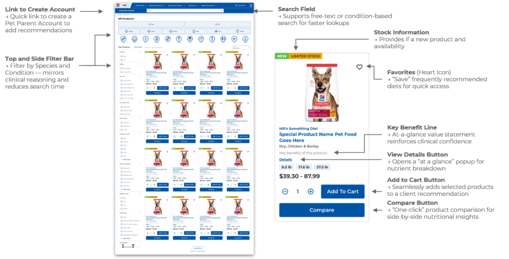
Example mockup of a reimagined PLP incorporating key elements identified through research.